
Project 01 / Lenovo
Redesigning product discovery for Gen Z
Context
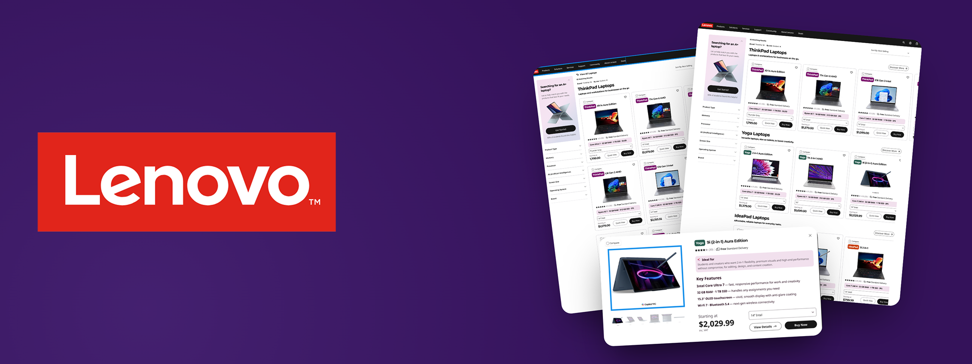
I was a product designer for Lenovo, tasked with redesigning their e-commerce site and Legion gaming community platform. The project was split across two teams and I worked on e-commerce. While mobile screens were also designed, desktop was the primary focus, since research showed most users purchase laptops on desktop, with mobile mainly used earlier in the funnel (ads, YouTube, TikTok) rather than at checkout.
Problem
lenovo.com wasn't built with Gen Z shoppers in mind.
The site overwhelmed non-technical users with dense, spec-heavy screens, offered no personalization, and showed near-identical products with no clear way to tell them apart.
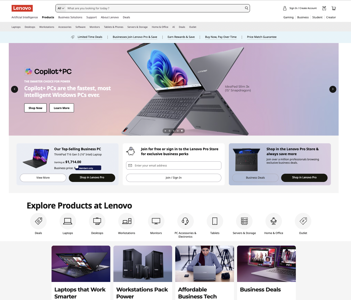
The lenovo.com homepage: dense, promo-heavy, and built for business buyers, not first-time Gen Z shoppers.
How might we optimize and personalize Lenovo's site-wide product experience to feel intuitive, engaging, and trustworthy for Gen Z users?
Research
We analyzed 7 competitor sites and interviewed 20 Gen Z students on their laptop-shopping experience.
Too much jargon, not enough translation
Competitors buried decisions in technical specs. Students said the same specs were hard to parse without prior knowledge.
Comparing models was a chore
Competitor layouts weren't built for scanning. Students struggled to compare multiple laptops quickly.
No clear path to "the right one"
Competitors lacked trust signals and guidance, so students were often unsure which laptop actually fit their needs.
Sites analyzed






translating research into design
Key Decisions
Four decisions that shaped the redesign
Simplified the Cards
Research showed non-technical buyers got overwhelmed by dense, spec-heavy cards and often gave up to check social media recommendations instead. How much to strip out wasn't obvious, so I tested a few real directions.
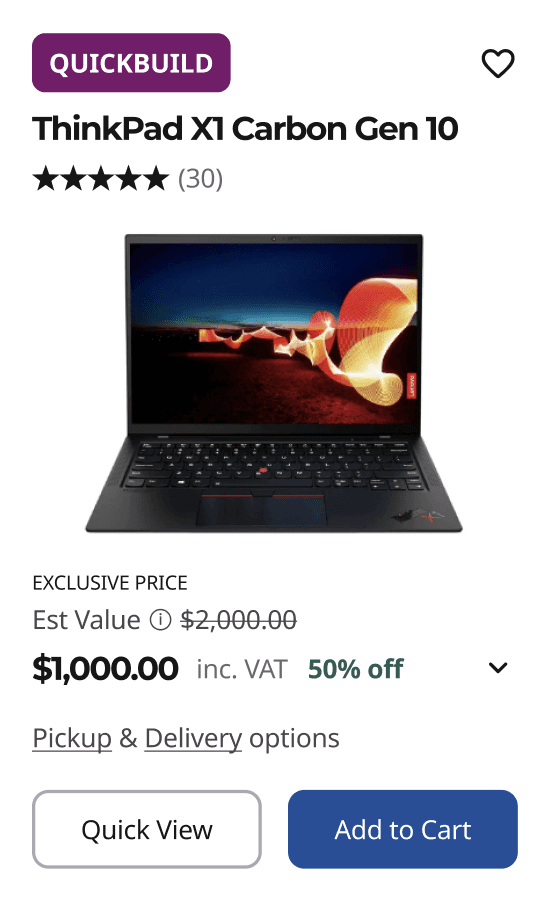
Deal-first, no specs
- Clean layout, price stands out
- Nothing to compare or judge fit on
Plain-language only
- Translates specs into use case
- Drops specs, no way to compare

Condensed specs, kept
- Enough info to compare, fast to scan
- Familiar spec format shoppers already expect
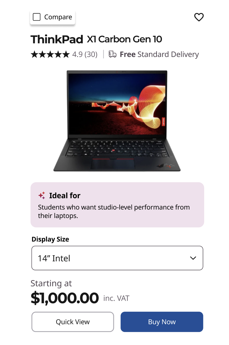
I chose Option 3. Cutting specs entirely solved the jargon problem but left nothing to judge fit against. The condensed spec pill gave buyers enough to compare without the density of the original.
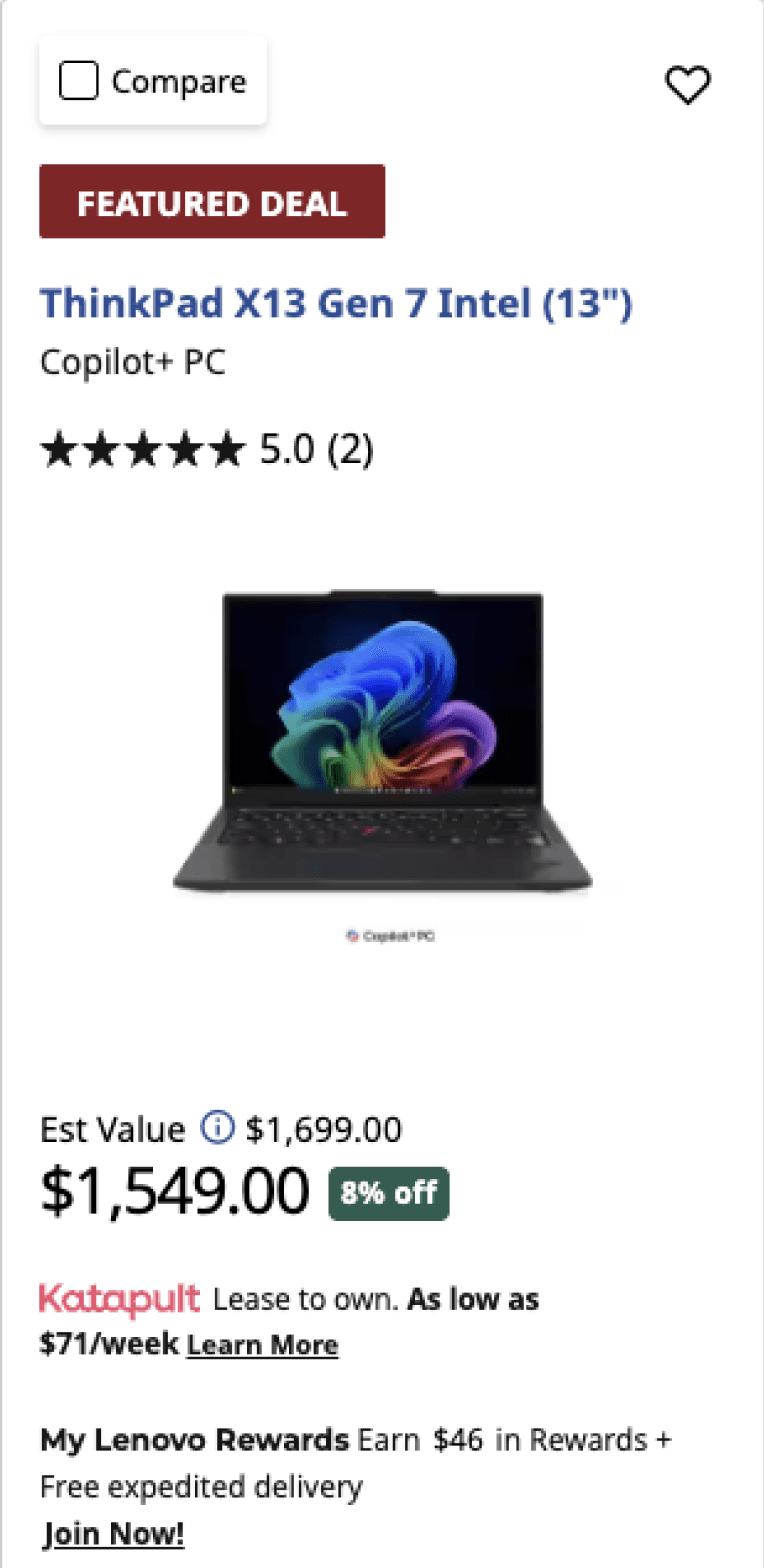
BBefore

AAfter
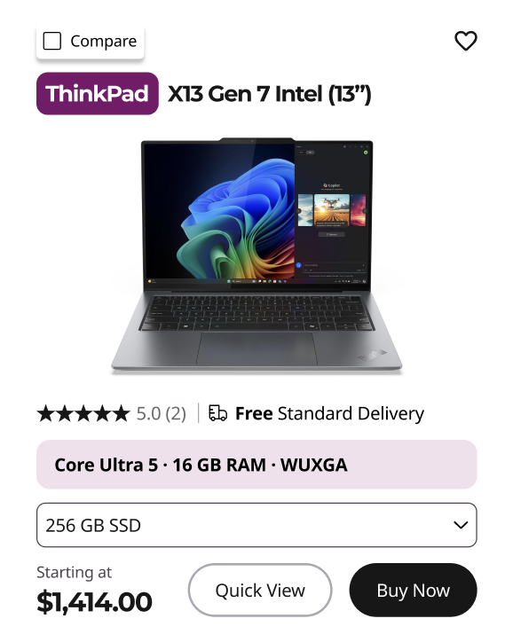
Color-coded tag for quick visual differentiation by laptop line
Condensed 5 raw spec lines into one translated summary
User interviews showed non-technical buyers got overwhelmed by dense, spec-heavy pages, and often gave up and went to social media recommendations instead of comparing on-site. I cut on-card information from 12+ data points to the 6 that mattered most for a first decision, removing financing details, rewards messaging, and delivery logistics. I also condensed five raw spec lines into one translated pill (Core Ultra 7 · 32GB RAM · 1TB SSD · OLED), and used color-coded tags to differentiate laptop type at a glance, instead of requiring users to read line by line.
Consolidated Duplicates
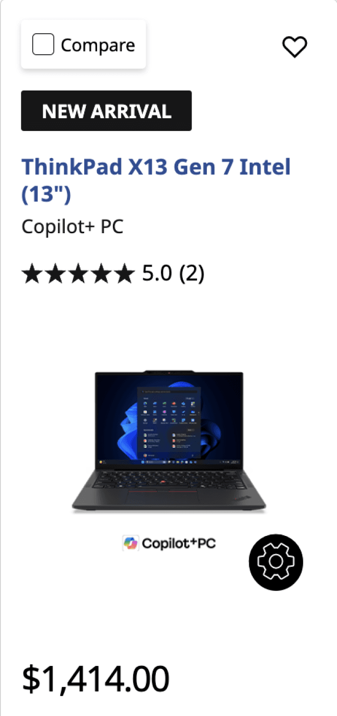
During interviews, several users asked the same question when looking at near-identical listings: what's actually different here besides the price?
BBefore



The merged card, up close
AAfter
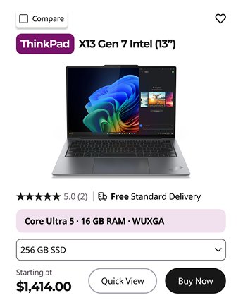
Storage now configurable inline, removing the need for a separate near-identical listing.
I merged cards that differed by a single variable (processor, color, or storage depending on the product line) into one card with an inline dropdown, letting users compare and configure that option without hunting across separate listings for what changed.
Reorganized Entry Point
BBefore

AAfter

Grouped listings by product line instead of one undifferentiated feed, letting users start from use case (i.e. ThinkPad for work) rather than filtering through a mixed list.
Research showed users couldn't tell what separated different devices or price points without opening each product page individually. There was no way to get oriented before digging in. I reorganized the entry point from one flat, filter-heavy list into laptops grouped by type (ThinkPad, Yoga, IdeaPad) so users could narrow by use case before comparing specs. Even with a "Student" filter applied, the original results mixed unrelated models at inconsistent price points; grouping by product line gave users a clearer, more relevant starting point.
Quick-View Modal
BBefore
Click into product page
Scroll to find specs
Go back to compare another
AAfter

Translates technical specs into a plain-language recommendation for first-time buyers who lack spec knowledge.
Lets users go from comparison to purchase without leaving the listing page.
Previously, comparing laptops meant clicking into each full product page individually. No shortcut existed. The quick-view modal surfaces the specs that matter most directly from the listing, with "ideal for" labels translating technical specs into plain use-case guidance for first-time buyers.
User Testing
We tested the final designs with 5 Gen Z students. Everyone completed a task to find a laptop suited for student use faster on the redesign than on the original site, and all 5 preferred the cleaner layout. Testers also confirmed they wanted brief specs visible directly on the card for quick scanning, and appreciated when technical specs were paired with plain-language explanations, validating the direction taken in the quick-view modal.
Final Prototype
After user testing and final team review, the design was refined further before delivery to Lenovo.
Desktop carried most of the design effort, since that's where purchases actually happen, but mobile screens were still built out to support Lenovo's site-wide experience across devices. Below, the desktop walkthrough followed by its mobile counterpart.
Desktop · primary experience
Mobile · supporting experience
Outcomes & Reflections
We presented our final designs to the Lenovo team. Testing with 5 Gen Z students confirmed the simplified layout: all 5 completed the task faster and preferred the cleaner design, and Lenovo indicated plans to implement the quick-view feature.
Working alongside 6 designers and 2 PMs pushed me to sharpen how I communicate design rationale, turning research into decisions the whole team could align on, even under a tight timeline. I'm grateful to my team for the collaboration and candid feedback throughout, and to Lenovo for trusting a group of students with a real, live product challenge. This project reinforced something I keep coming back to: Good design isn't about having the final say. It's about building a case clear enough that the right decision becomes obvious to everyone in the room.