PROJECT 03 / CClubs
Simplifying Club Discovery for Cornell

ROLE
Product Designer
TEAM
2 Designers (partner project)
TIMELINE
Feb–May 2025
CONTEXT
With over 1,000 student organizations at Cornell, students often struggle to find where they belong and stay under-informed about their options. My partner and I designed CClubs, an app that streamlines club discovery through filters, peer reviews, and centralized events.
PROBLEM
There's like a thousand of them and no way to actually compare.
Did you find a club to join yet?
a conversation every Cornell student had
Finding your place at Cornell can feel overwhelming. With over 1,000 student organizations, students often rely on word-of-mouth, Instagram posts, or scattered Reddit threads to decide where to get involved, without knowing if a club's culture, time commitment, or goals actually fit.
How might we design a product that makes club discovery less overwhelming and helps students confidently find communities that match their interests and commitment levels?
RESEARCH
We interviewed 4 Cornell students and synthesized findings into an affinity map, then compared existing platforms students already rely on.
INTERVIEWS & AFFINITY MAP
1
Too many choices
1,000+ clubs left students overwhelmed and unsure where to start.
2
Unclear commitments
Students often joined without knowing time or culture fit.
3
Scattered discovery
Word-of-mouth and Instagram were the main sources, creating gaps in access.
4
Competitive processes
Selective clubs felt intimidating, with unclear expectations and little feedback.
5
Need for transparency
Students wanted clearer info on applications, timelines, and prep resources.
COMPETITOR ANALYSIS
Primary Sources
Campus Groups
Also Considered
ClubFest
Google Calendar
What worked
Provided visibility and occasional updates.
What didn't
Scattered and inconsistent. No filtering tools. No credible peer insight into fit.
No platform let students filter clubs, compare them side by side, or trust what they were reading about them before showing up. Reddit and Instagram gave visibility but no structure. CampusGroups listed clubs but didn't help anyone choose between them. That was the gap CClubs was built to close.
translating research into design
IDEATION
Using our research insights, we translated pain points into design opportunities and mapped low-fidelity flows across the whole app, onboarding, explore, home page, favorites, upcoming events, club profile, and user profile. I took the lead on four of these screens: home page, favorites, upcoming events, and club profile, testing ideas for how users could explore, save, and plan around clubs that interested them. Most flows came together quickly, the home page took the most iteration, since getting trust right on the very first screen mattered most.

KEY DECISIONS
DECISION 01
Recommendations Over Ratings
Early ideas leaned on detailed ratings to help students judge clubs quickly. Testing showed this created more problems than it solved.

Ratings-heavy layout
Quick view of stats
Cluttered, multiple rating scores

Expanded rating and tags
More detail on clubs
Overwhelming, dense

Personalized + categorized
Preference-based
Most feasible for real-world use
We chose Option 3. Numerical and star ratings raised more questions than they answered, and risked misrepresenting a club over a bad fit rather than a bad experience.

1
Personalized row replaces a rated list, matching clubs to a student's stated interests instead of ranking them by score
2
One number replaces the old star breakdown, enough for a gut check without implying false precision
Numbers felt objective but weren't. Replacing the rating breakdown with recommendations meant students could trust what they saw without the app pretending to know something it couldn't measure.
DECISION 02
Trust Through Peer Review, Not Stats
Early Iterations
Final Design

Application deadlines and a five-point ratings breakdown

1
AI-summarized reviews replace the raw stats table, giving students a quick read on culture without parsing rows of numbers
2
Quick tags surface commitment and social level at a glance, pulled from real student language instead of a self-reported rating
Early versions surfaced deadlines and raw stats, but testing showed this didn't help students judge culture fit. We moved to AI-summarized reviews with quick tags instead.
DECISION 03
One Tap to Register
Early Iterations
Final Design

Date-first cards for each event listing
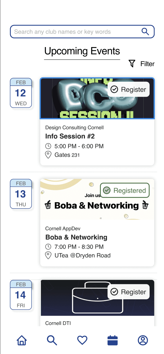
1
Time and location shown directly on the card, no extra tap required to see them
2
A direct Register button replaces the passive favorite icon, so signing up takes one step
An early version led with a clean date-first layout, but testing showed it buried time and location behind extra taps, students had to open each event just to see basic details. We redesigned the card so date, time, and location are all visible up front, with a direct register button in place of a favorite icon.
DECISION 04
No More Bouncing Between Apps
Early Iterations
Final Design

External links to each club's own registration form

2
A short club preview links out to the full profile, so students get context without cluttering the main screen
1
No external form to open; Registering and adding to calendar both happen without leaving the app
The first version sent students to each club's own external registration form. That kept the workload off clubs, but it meant leaving the app entirely to register, then losing your place. We moved registration in-app, so students could register and add an event to their calendar without ever leaving CClubs.
FINAL PROTOTYPE
Club Discovery, Simplified.
OUTCOMES & REFLECTIONS
We tested the concept with 5 other Cornell students. 4 students said CClubs made club discovery feel significantly easier than Cornell's current Campus Groups platform, and the personalization feature stood out as a genuine improvement over browsing an unfiltered list.
This was the first project where I really had to think like a product designer instead of an artist, every choice needed a reason behind it, not just a look I liked. My partner and I went through a lot of rounds on the rating system, the registration flow, and the review format, testing each one against real constraints, like what a club would realistically keep updated or how much a student would tolerate reading on mobile. Working closely with one other person meant we were constantly pushing each other's ideas and staying honest about what students actually needed, not just what looked polished.
If I had more time: I'd keep testing the review and rating system to make sure it holds up as more clubs and reviews get added.
Get in touch :)
tq
.
· © 2026