PROJECT 02 / OPPORTUNA
Building Trust from Zero


OPPORTUNA
ROLE
Product Designer
TEAM
2 PMs
5 Product Designers
TIMELINE
Sept 2025-Dec 2025
CONTEXT
I was a product designer for Opportuna, a venture capital firm, through Cornell's Design Consulting Club. Our team completed a full brand refresh and website redesign, followed by a 0→1 LP portal — a platform for Limited Partners (the fund's investors) to track where their capital goes and the results Opportuna delivers. The portal included onboarding, dashboard, portfolio, reports, and chat sections. I co-designed the dashboard with one other designer; this case study focuses on that work.
PROBLEM
scattered across 5 tools
Excel spreadsheets
Notion docs
Outdated PDFs
Ad hoc calls
Disorganized Emails
Opportuna had no existing system for LPs to view fund performance: reporting happened through scattered, ad hoc communication rather than a dedicated platform, leaving investors without a reliable way to track their capital.
How might we create a clear, concise, and professional platform for LPs to see where their funding goes and the results Opportuna has produced?
RESEARCH
We interviewed 12 professionals and pre-professionals in finance and analyzed 10 competitor platforms to understand what LPs need from a fund reporting tool.
FROM INTERVIEWS
Summary first, detail on demand
Users wanted high-level KPIs (IRR, MOIC) up front, with detail reachable in 2 to 3 clicks, not buried in a cluttered interface.
Consistency builds trust
Timestamped, regular data built credibility more than visuals. Quarterly updates felt reliable; frequent notifications felt like noise.
Data lives everywhere but one place
LPs pull updates from Excel, Notion, and email. They wanted one platform that flags what changed and what's urgent.
FROM COMPETITOR ANALYSIS
Show what matters first
Juniper Square's focused, external-facing views outperformed Jira's dense, utility-heavy layout.
Specialized tools mapped better
Dynamo for VCs and Allvue for fund ops fit real workflows more closely than generic platforms like Notion.
Guided setup, light automation
The strongest platforms paired the two. Heavy customization created friction instead of reducing it.
Together, these pointed to one core need: a platform that leads with a clear summary, earns trust through accuracy over decoration, and gets LPs from data to decision quickly.
translating research into design
IDEATION
Since the LP portal was being built from scratch, we explored multiple layout directions before settling on a final structure.
OPTION A
OPTION B

We chose Option A. It made fund metrics the clear priority. As we moved from this low-fi toward high-fi, we also cut the task-tracking section entirely, it competed with the performance charts for attention, and wasn't something LPs actually needed on their dashboard.
KEY DECISIONS
The main dashboard leads with five key fund metrics (DPI, TVPI, PIC, Fund Gross IRR, LP Net IRR), followed by J-curve and Gross vs. Net Spread charts, Recent Updates, and New Documents, all visible without scrolling. This gave LPs a complete read on fund health in a single glance.
DECISION 01
Main Dashboard: Metrics, Trends, and Updates in One View

2
Recent Updates and New Documents surface what's changed and what needs attention, without requiring LPs to check email or other tools
1
Storage now configurable inline, removing the need for a separate near-identical listing
1
Five top-line metrics answer how the fund is doing before anything else
The main dashboard leads with five key fund metrics (DPI, TVPI, PIC, Fund Gross IRR, LP Net IRR), followed by J-curve and Gross vs. Net Spread charts, Recent Updates, and New Documents, all visible without scrolling. This gave LPs a complete read on fund health in a single glance.
DECISION 02
Reviewing and Signing Documents Without Leaving the Portal

1
Turns a dense legal notice into numbers LPs can scan in seconds
2
Signing happens in the portal, no external forms or emailed PDFs required
DECISION 03
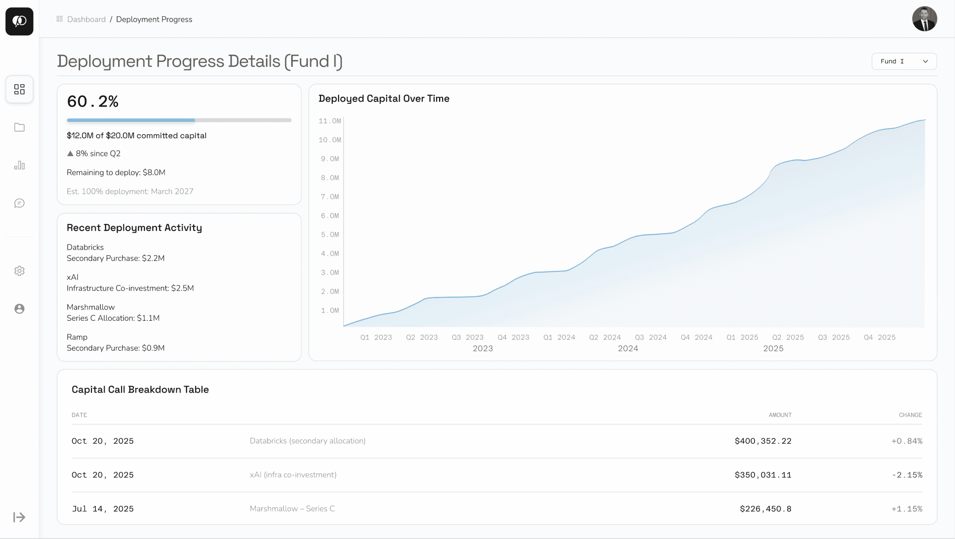
Drilling Into Deployment Details on Demand
2
Every capital call itemized with date and amount, so LPs can trace exactly where funds went
1
A multi-year trend, not just a snapshot, lets LPs see deployment pace and judge whether the 2027 projection is on track
From the main dashboard's overall progress card, LPs can click into a full deployment view: a trend chart of capital deployed over time, recent deployment activity, and an itemized capital call breakdown table. This kept the main dashboard focused on a quick summary, while still giving LPs a path to full detail when they wanted it.
FINAL PROTOTYPE
After several rounds of design critique and iteration, this is the final version of the dashboard, presented to Opportuna's team.

OUTCOMES & REFLECTIONS
We presented the final LP portal to Opportuna's founding team, alongside the completed brand refresh and website redesign. The dashboard was well received for translating dense fund data into something LPs could actually parse quickly, and Opportuna's founding team approved moving forward with the design.
Designing 0 to 1 meant there was no existing pattern to react to, every structural decision had to be justified from research rather than corrected from an existing flaw. Working closely with one other designer on the dashboard specifically taught me how to divide ambiguous problems into concrete pieces we could each own, then bring back together into one coherent experience. This project also pushed me into an industry I didn't know well going in, and translating unfamiliar financial concepts into something legible for LPs is a skill I'm proud to have built.
Get in touch :)
tq
.
· © 2026